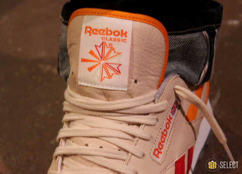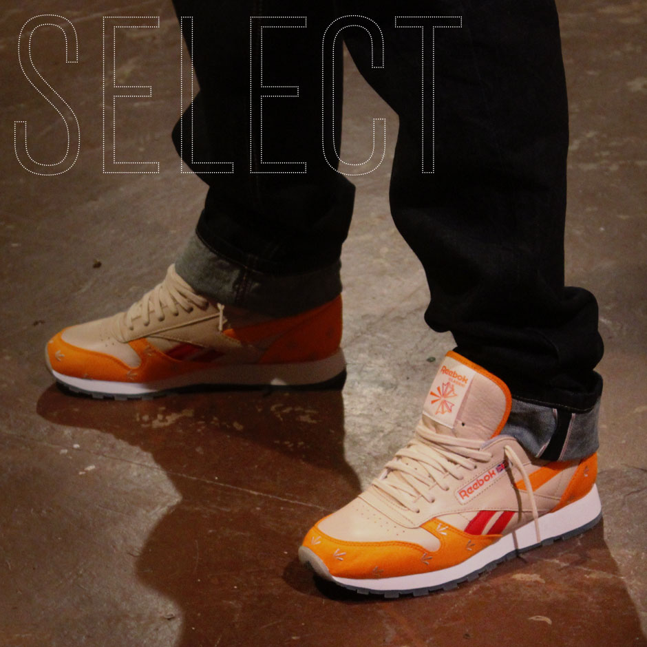
Reebok Classic Leather by Gary Warnett

Footwear collabs are everywhere you look these days, but despite the oversaturation and overuse of the “A x B” formula by almost every brand you can name, the truth is that it can’t be ignored as a powerful tool to build some buzz around their products. Aside from the sense of intrigue and importance that these co-branded initiatives can bring to a project come release time, it’s also a pretty shrewd business move to recruit eager and capable individuals to do your work for you. It’s easy to see why it makes sense for the shoe brands to continuously go to these outside wells, but they’re not the only ones reaping the benefits.
As consumers, we’ve been bombarded by sneaker collaborations ad nauseum, but without them, we’d be missing out on the some of the most original concepts, approaches and executions currently being produced. By reaching outside their walls and tapping into a broad spectrum of creative sources, these projects open the door for all sorts of stories to be told and personal visions to be realized. Naturally, there are plenty of misses to go along with the hits, but there’s no denying that they make the landscape much more interesting than it would be if we were forced to rely on in-house efforts alone.
Because of the historical success and current popularity of the tagteam blueprint, the field of worthy collaboration candidates has expanded considerably beyond just sneaker boutiques, corporate partners and rappers to include creative partners from all different nooks and crannies of the industry and its various related subcultures. Nowadays, new and unexpected precedents are being set all the time and we’re constantly treated to fresh new takes on classic silhouettes thanks to a veritable melting pot of unique individuals and perspectives.
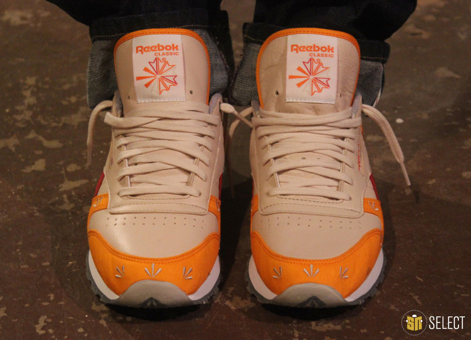
If you’re familiar with his work, you’re well aware that Gary Warnett is one of the sneaker world’s most knowledgeable and insightful voices, but it still came as a bit of a surprise to learn that he was collaborating on a shoe with Reebok. Best known for his edutaining footwear write-ups and his affiliation with UK heavyweights, Crooked Tongues, Gary is as qualified and deserving as anyone to design a shoe, but he’d be the first to tell you that it was an opportunity he never could have expected. Continue on as Gary fills us in on the story behind his Reebok Classic Leather and much more, and make sure to keep an eye out for them hitting Packer Shoes and other global Reebok accounts this coming Saturday, October 12th.
Sneaker News: For those who may not be familiar, please give us a little background on yourself and your history in the footwear business.
Gary Warnett: My name is Gary Warnett and I feel grizzled after just a few years in this industry. My first full-time job in this business was working for Crooked Tongues where I was tasked with writing store descriptions and content — I was convinced that I’d be fired if I didn’t write enough, so I just used to pad paragraphs out with nonsense. I’m surprised I wasn’t fired for that to be honest.
After a few years in, I started to dabble in some freelance things — I was writing copy at an agency level for some big brands then because Russell Williamson, who was the man behind the whole thing took a risk with me — and then things changed and I put out a call on Twitter to see if anyone wanted any freelance work and things snowballed from there really. Along the way I’ve been able to contribute to a few collaborations and events, so it wasn’t all writing. I have a little blog that I throw some weird topics on and I think that helped show I wasn’t just talking about sports footwear (even though I’m pretty obsessed with it), so I’ve ended up with some repeat clients that are brands I grew up loving. I still find it
trippy that I do this kind of thing to be honest. I think it’s easier to make a mark in the UK than it is in the States — shoes were more of a niche thing here, so it was just the right time and right place.
SN: Obviously you’ve established yourself apart from Crooked Tongues with your writing work and other personal projects, but how did it come about that you actually got to design your own Reebok shoe?
Gary: I have no idea. Ryan Cross, who’s a good guy and somebody with crazy industry experience (he was down with the Pervert crew, which was one of the great streetwear brands of the early 1990s) and I have crossed paths a few times and he emailed me then phoned me up about doing a Classic. I suspect that my friend Frank the Butcher put in a good word. I know that everyone’s like, “I jumped at the chance!” when they recount these things, but I’m genuinely a huge fan of this shoe. I mean, there’s way too many collaborations in the world right now and I’m not sure that they’re always built on a real love for the product — it’s now just part of the PR process, but I don’t think I’d want to work on a shoe I couldn’t stand by…well, not as a solo project.
SN: What’s your personal history with the Reebok Classic?
Gary: My dad wore them, but so did the bad kids around my way. In the UK it was a very democratic shoe. It was clean, affordable and it’s very, very versatile. It almost has a stigma because in Britain we tend to turn on things that are like that — it’s a shame really. I really liked the fact that the Classic was worn by this person who raised me to work hard and behave — a huge role model to me, obviously — but also the kind of person who’d lead you astray. It has a duality to me.
SN: How did you approach your first collab shoe and what were your goals for it going in?
Gary: You know what? You can’t top this shoe in white with an ice sole or black with a gum sole. Simplicity is best on this one, but I wondered what would happen if you messed with the formula a lot. As well as that, there were some teal and orange editions with gum soles recently — that’s what I would have liked to have done if they didn’t already exist. I actually hate concept led footwear. Most of the great colorways in history were there because they just looked cool or highlighted something important. Now it’s all story led or crappy nicknames — those things used to bestowed on forums to ID a Dunk, which was cool, but now they’re there from the start. I’m not a fan.
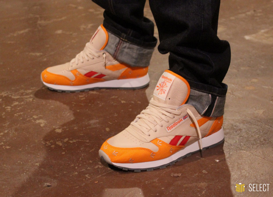
So, because a simple makeup wasn’t going to work, I was wondering how crazy you could go with a concept, even though they’re not my thing. I mean, if you need to be told why something looks like it does to enjoy it, then it probably isn’t that good. But, I thought I’d make this shoe like a blog entry by me — just lots of related stuff all interlinked, plus some pointless stuff. But I didn’t want lace jewels and fancy lacetips — I find that distracting (word to Frank Costanza). My shoe is already busy.
SN: Did the shoe undergo any major changes during the design and sampling process or is the final version pretty close to your original vision for it?
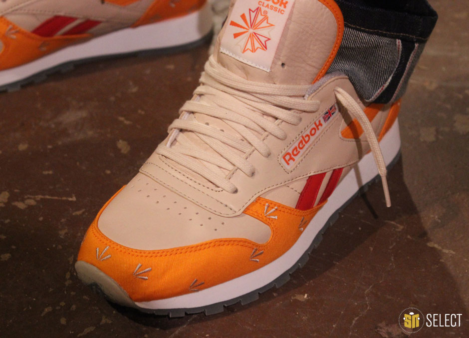
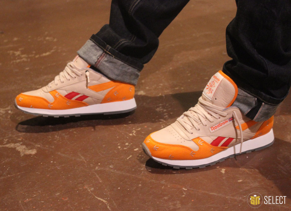
Gary: Loads of changes. The canvas changed from a washed-out red to orange, the arrows face a different direction, the sole got patterned, there was an ill fated attempt to perforate arrows on the toebox. Just mad stuff — all down to me I might add. David Ting at Reebok has the patience of a saint. I’m not a designer — I just had some ideas and created some tech packs that looked like something from the opening titles of Se7en. I’m terrible on Illustrator and I’m not gonna start disrespecting designers everywhere by claiming I can design!
SN: Is there any deeper inspiration or story behind the color scheme or was this more just about creating a good shoe?
Gary: Like I said, usually the latter, but yeah, there’s lot of concepts here. Maybe too many! As I said earlier, there’s a bit going on here. One early concept was to just make a Reebok in Supermalt colors – I don’t drink alcohol and that’s the closest to alcohol that I drink in terms of flavor and the shoe is known in the UK as a “pub shoe” – we have a big pub shoe culture that favors white running and tennis silhouettes, so I was trying to make a non-alcoholic pub shoe. Then that thought process went to what those pubgoers used to like to wear with Classics, which is gear with Polo, Lacoste or YSL embroidery — that’s when I started thinking about having some kind of repeat embroidery.
Then (and I have to shout out Charlie Morgan, Mubi Ali, Nick Schonberger, BJ Betts Chris and Frank for the feedback, help and ideas) that turned into this criminal shoe concept. I kind of wanted to put a tan leather Classic in a prison uniform as if it was apprehended for all those past crimes. No brand can ever acknowledge that kind of thing, for obvious reasons, but I thought I’d face it head on.
Back in the day, British prison uniforms had broad arrows on them to denote government property. This was a big shoe with criminals (a popular footprint at crime scenes) in the UK and I was reading Azie Faison’s book and he mentioned some Harlem kingpin wearing white on white Reeboks in the 1980s, so I knew there was some tenuous parallels there between Britain and the States, albeit
in different decades. Reading a book on vintage clothes I saw some 1940s prison shoes with arrows etched on the forefoot. So I thought it would be amusing to bring the Polo repeat and the prison thing together.
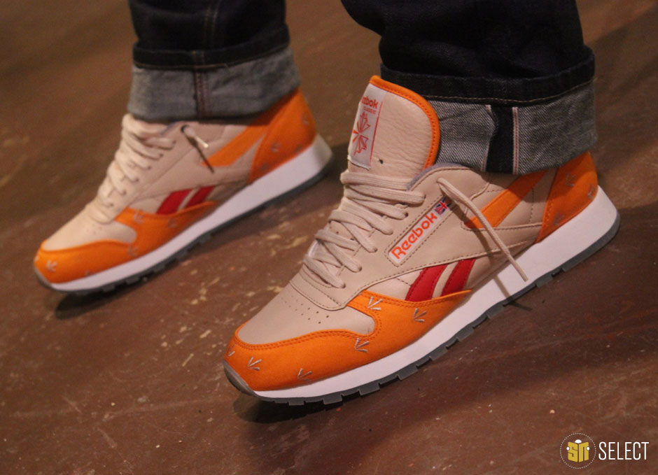
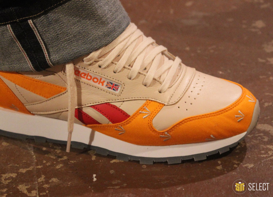
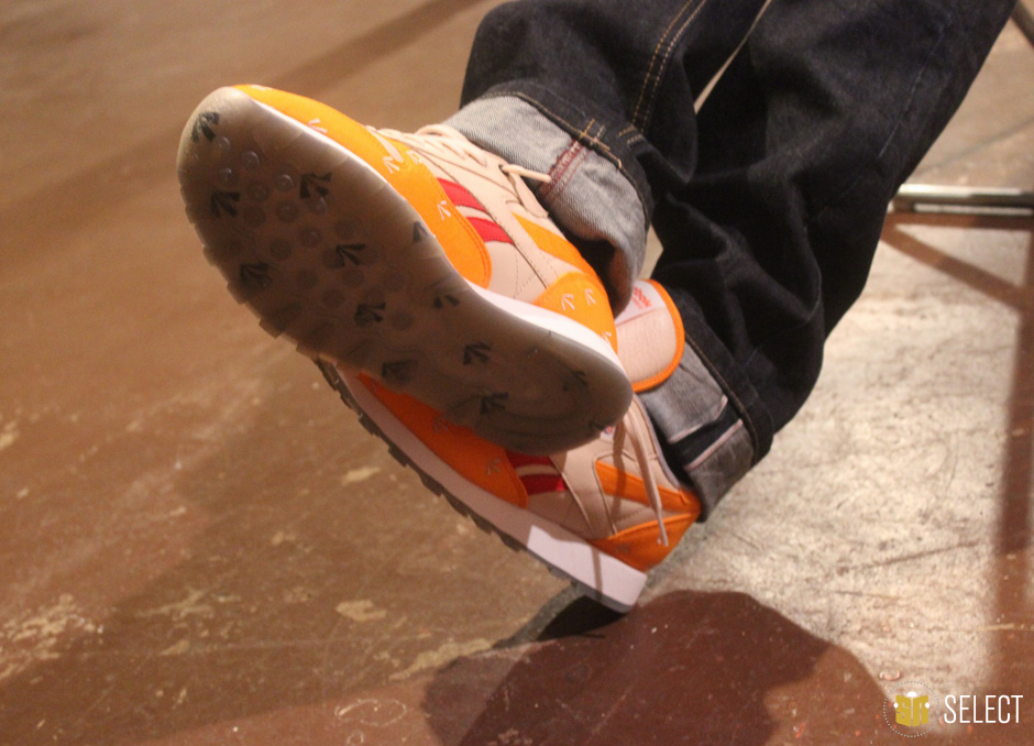
So that canvas is some imaginary prison uniform meets sports casual thing and there’s some other elements. The arrow callout in the Union Jack was too obvious, and I’m an obvious person so I did it. The grey lining is based on prison sweatshirts and Nick mentioned the concept of the borstal dot to me –a borstal was a UK youth detention center – and there was a tattoo between the right thumb and forefinger that denoted the bearer’s criminal past. So why not make the top eyelet of the right shoe’s medial side black? And ice soles on Reeboks are a classic — there used to be crazy things under those things back in the JD Sports exclusive era where this shoe was huge and given that it was a footprint seen at a lot of crime scenes in the early 2000s, I decided to put some arrows under there too. So it’s kind of like some imaginary government issue prison uniform in an imaginary world where sportswear brands compete for prison contracts.
I really don’t think that a shoe needs to have some crazy back story to be appreciated. But hey, all that prison stuff was more fun to do than throwing a camo on it. I love camouflage but I’m not sure that the criminal stuff is any more of a gray area than the celebration of war aesthetics. Maybe I’m wrong.

SN: What’s the significance of the repeating graphic we see embroidered into the upper and printed on the outsole?
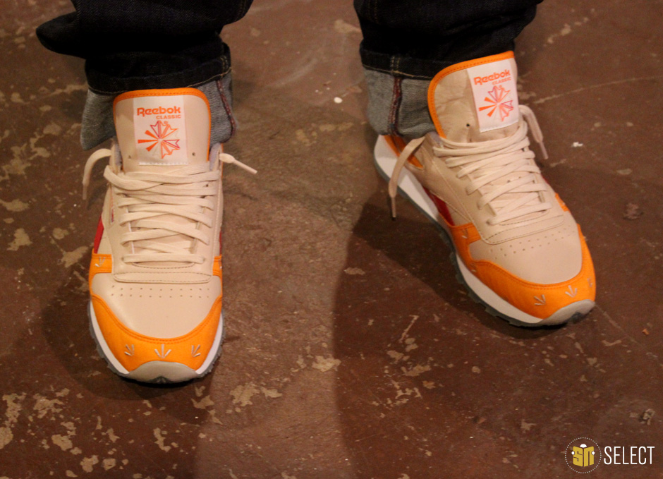
Gary: Like I said, that broad arrow marking is a classic prison suit pattern from the olden days. It’s not just used on prison outfits but it’s remembered more for that. Traditionally it goes upwards but we made them go forward to create a sense of speed and motion — after all, the Classic was advertised as a real running shoe in the running press back in the mid 1980s.
SN: What are your thoughts on the current state of footwear collabs?
Gary: Too many out there. Remember back in 2006 when things got too collaboration heavy and everything imploded? That’s happening again. But with Instagram and a bigger blog environment, I think it’s an effective marketing tool. For the most part I’m not really a fan of them. There’s exceptions though — I mean, on the Reebok front, SNS’s DMX in black 3M was great and Palace and Garbstore’s shoes are excellent — I think Brits really have a connection to this shoe. I love how Frank color blocked his Classic too — when I saw that I knew I had to “borrow” that split stripe.
SN: Are we approaching overkill or are they keeping things interesting by tapping into so many different creative sources?
Gary: We’re beyond overkill. But, I tend to steer clear of it — I’ve been wearing the same pair of snakeskin Chucks since April. All that crispy shoe stuff is for the youth — I’m enjoying watch my shoes disintegrate with every wear. There’s still some collaborations set to drop that I wish I’d worked on. All that nickname stuff is still corny though.
SN: How crazy is it to have your own shoe?
Gary: Just strange. Working with brands is still novel to me. I still get excited over product and I can be a slave to the hype, so it’s trippy. I definitely don’t take it lightly. I’ve spent the best part of a decade assuming I’ll be out of a job soon and I still do, so I really appreciate the opportunities. I’m not going to start gushing on Twitter about being “blessed” because I’m British, but it’s a fun experience.
SN: After growing up living and breathing this stuff all these years, is this something you could have ever imagined?
Gary: No. Growing up with everyone wearing the Classic and having a personal connection with it is crazy. I mean, you shouldn’t be working on shoes you don’t actually love — I think that shows in the marketplace that’s flooded with collaborations. Back in the mid 1980s it was a Reebok shoe that helped make me an obsessive — my brother played tennis and my mum let him have two pairs of shoes: some garment leather adidas tennis shoes and a takedown of the Reebok Phase One. I was jealous of those shoes and I swore then and there that I’d have a load of shoes when I got older. I also remember being at school and a kid having some 4600s and I was disgustingly jealous of him — Reebok wasn’t cheap back then. I was a jealous kid — a young hater.
SN: What’s your etiquette policy on wearing a shoe that you’ve designed?
Gary: Don’t think I could do it. That would be too strange. Maybe with a Polo tracksuit to the shops one day. If someone asked you about your shoes you’d look like a dick.
SN: So is it more of a thing where you just put it out there and let other people enjoy?
Gary: Absolutely. I hope they’re not unwearable. With a little more time I would have loved the canvas to be canvas coated for inclement weather, but you can’t have everything. I want to reiterate this: I’m not a designer. The designer is the person who actually created the silhouette for instance, Reebok design legends like Paul Litchfield and Paul Brown. Or it’s people like David Ting who does a ton of colorways and material executions for a living — they do so, so, so much work every season. Some guy like me stumbling along with a weird idea, doing one shoe and needing some assistance on Illustrator is not a designer.
SN: So is this project more of a one shot deal for you or are we only seeing the beginning for Gary Warnett footwear collaborations?
Gary: Nah, I’ll leave the designing to the designers. I’m working on a new site about shoes and a book on the topic too, plus some other stuff.
SN: If you could work with any brand or silhouette in the world, what would be your ultimate dream collab project?
Gary: You know what? Most of the shoes I love are great because of the colors, so me getting involved would screw them up. I’ve done a Classic and made one-offs of Air Force 1s, Clydes and 576s. I’m happy. A 95 would be good because iD only let you do so much with it. Actually, I’d like to do an ACG colorway because I love that series — they already have definitive makeups, but people like Trip Allen really created a sense of limitlessness with what you could apply to some shoes. It sits with the offroad, new frontier feel of that range. As far as other shoes, I mean, if you’re doing a Jordan, do better than the original four colorways of the Jordan III or don’t bother at all.
—
A big thanks to Gary for taking the time to talk shop with us. Do yourself a favor and check out his blog and Twitter where you’ll undoubtedly learn a thing or two about sneakers (or trainers as he’d prefer) and be treated to some brilliant dry laughs in the process. And of course, look out for his shoe hitting select Reebok retailers this Saturday, October 12th.
