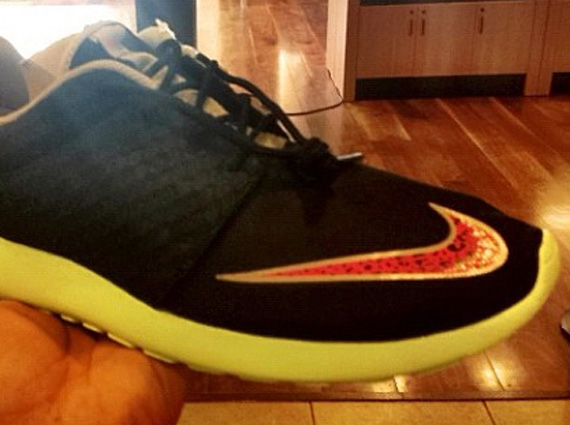
One of the surprise mega-hits of 2012 is without question the affordable and minimalist Nike Roshe Run. At just $70 a pop, these cleanly-designed Sportswear offerings were veritable ‘no-doubters’, leaving sneakerheads to cop multiple pairs of the library of colorways that hit stores. But with such a basic and simple design, the expansion of the Roshe can only lead to premium-grade materials, which we’ve already seen, and altered compositions, like this 2013 version. Aside from the change in upper material and thicker sock-liner, the Swoosh-placement – clearly one along the lines of Nike’s Training/Football concepts – is the most notable alteration from this purported ‘part 2’ of the Roshe. Thoughts on this change? Peep the full shot below and stay tuned for more updates.
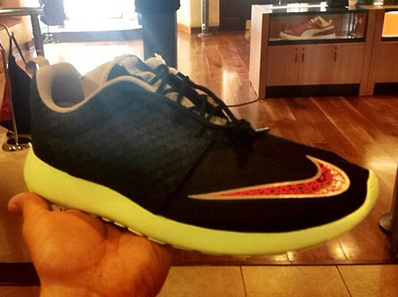
Photos: cee_210


