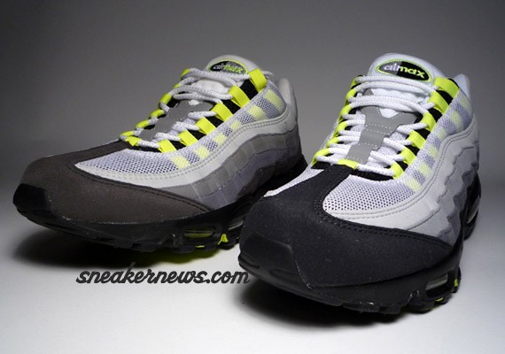
Left: History of Air | Right: 2008 Retro
By now most of you have heard that Nike has retro-ed the classic Air Max 95 Neon once again, this time coming out along side the Air Force 1 Neon and Court Force High Neon AM95 inspired colorways. However, what many of you have not noticed the differences between this version and the last retro during the History of Air Celebration. We’re only too happy to provide a side by side comparison of the HOA Version and the 2008 Retro for your reading enjoyment! With the classic AM 95 on the left (HOA), sporting a charcoal gray front, and the new (2008) retro edition on the right with a black toe, the differences between the two editions are VERY subtle to the eye. Other than the general replacing of charcoal gray with black, other differences include a switch of black and gray on the Air Max 95 logo, a different insole, different materials on the lining, and a very subtle coloration difference between the shades of white used on each pair, although that difference may be simply chalked up to the age of the original versus the new edition. With the replacement of the charcoal grey with the black, the neon definitely pops a lot more. For those of you lucky enough to get your hands on the quickstrike retro, more power to you for picking up such a great edition of a classic pair of kicks. For those who didn’t, you definitely missed out on one of the best drops of this year! Thanks Matt (Alife) for the heads up on the differences.
More photos below…
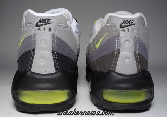
Left: 2008 Retro | Right: History of Air

Left: History of Air | Right: 2008 Retro
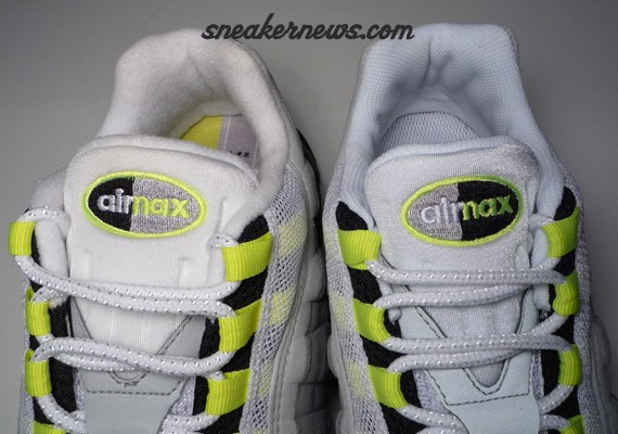
Left: History of Air | Right: 2008 Retro
Check out the Nike Air Max 95 – History of Air below
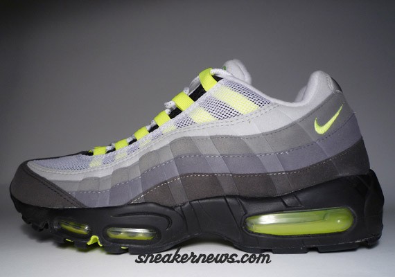
Nike Air Max 95 – History of Air
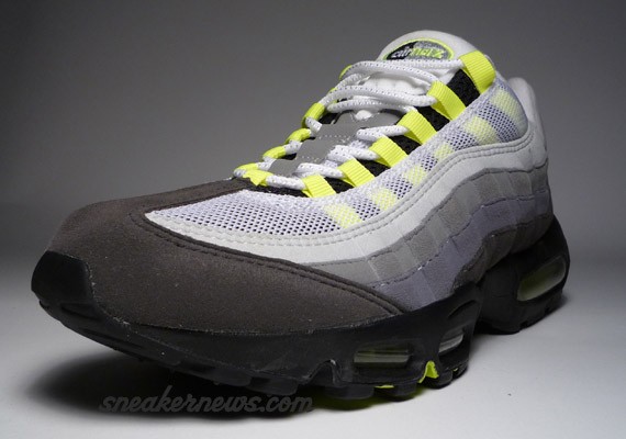
Nike Air Max 95 – History of Air
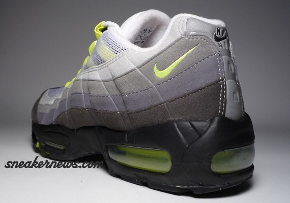
Nike Air Max 95 – History of Air
Check out the Nike Air Max 95 – 2008 Retro below

Nike Air Max 95 – 2008 Retro
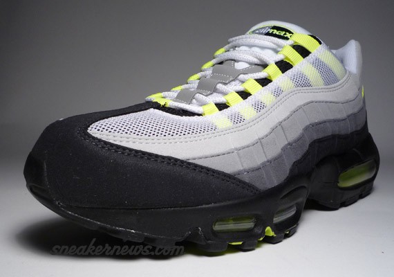
Nike Air Max 95 – 2008 Retro
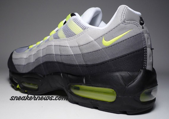
Nike Air Max 95 – 2008 Retro

Nike Air Max 95 – 2008 Retro

